Fire Haus Cannabis
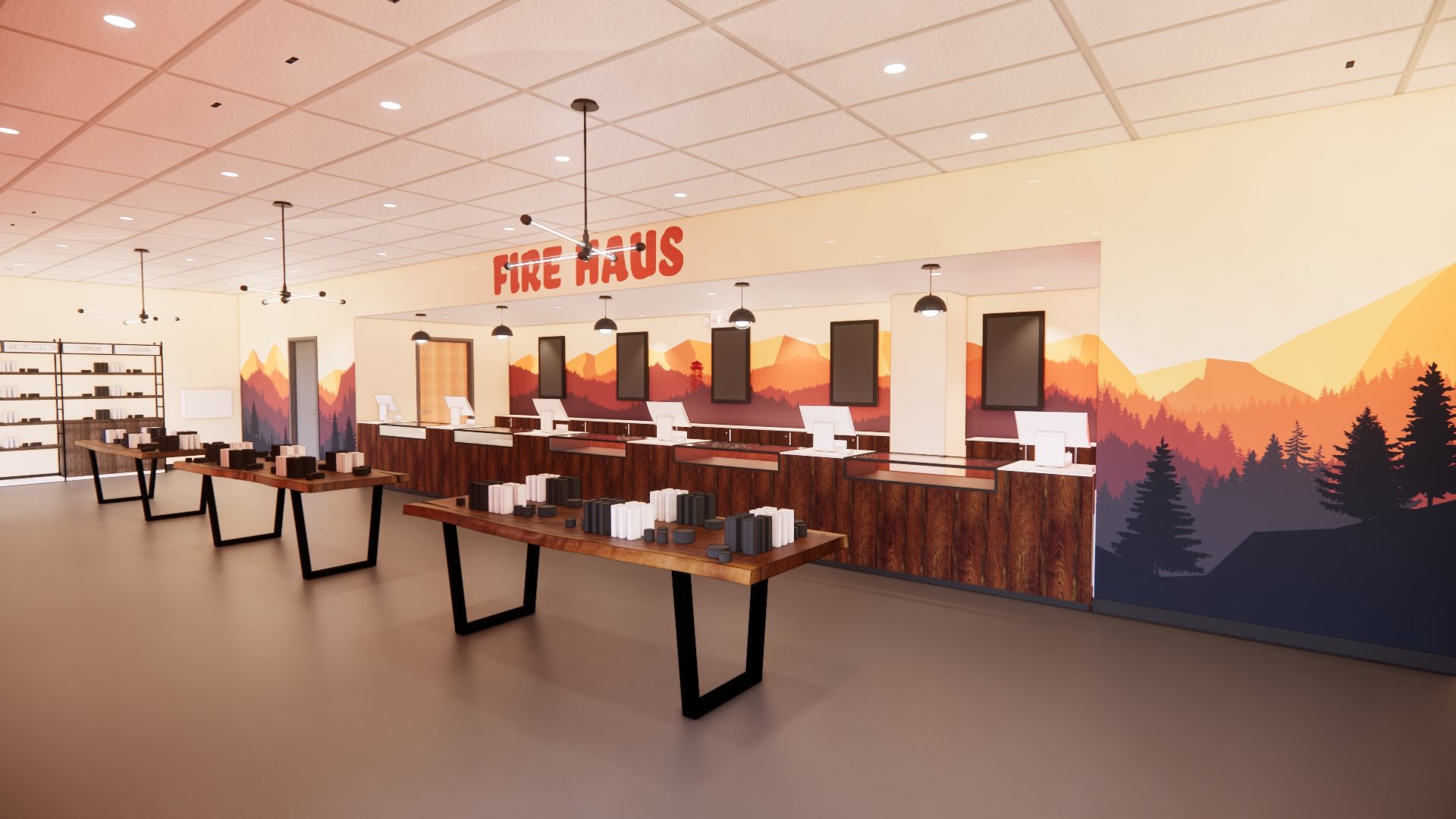
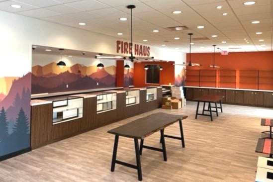
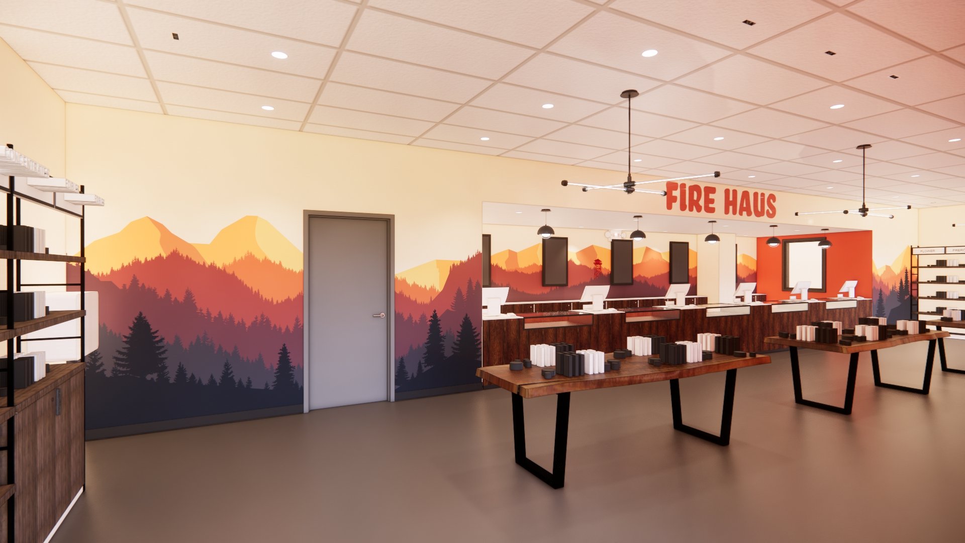
The owner and operator wanted his brand to represent a connection to the wilderness of the surrounding Potsdam area. Having grown up in the area, they have spent countless hours enjoying and exploring the outdoors. This connection to the outdoors and the Adirondacks is at the core of his brand and, subsequently, the retail experience he wants for his customers.
As one begins to explore the Adirondacks, fire towers can be seen peaking through the lush foliage of the trees. These fire towers are often a destination for local and visiting hikers as they provide expansive views of the surrounding wilderness. Imagery of the Adirondack Forest Service, lakes, and woodlands were gathered and leveraged to create a sense of nostalgia. From which motifs and a color pallet naturally emerged.
The image of the fire tower became the main symbol of the brand – The Fire Haus NY. This image coupled with the colors of fall in the Adirondacks and the use of wood tones and textures began to evoke a sense of place within this area.
-
Location: New York
Client: Fire Haus Cannabis
Type: Existing Building Renovation
Completion: Fall 2023
Area: 3,835 SF
-
More info coming soon.
-
Architectural + Interior Design
Custom Casework and Display Design
Custom wall graphics
Brand integration


